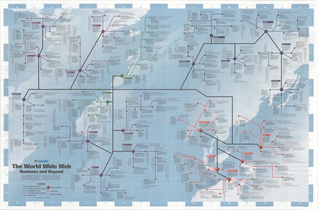
Subject: Cartographic Miscellany, Internet
Period: 1995 (published)
Publication:
Color: Printed Color
Size:
36.5 x 24 inches
92.7 x 61 cm
This vintage map was designed for pioneers of a new frontier: the World Wide Web. It was one of a dozen or so road map-like posters published by PC Computing magazine in the mid-1990s as a marketing ploy to set them apart from competitors like PC Magazine and PC World. For this "road map," graphic designer Timothy Edward Downs drew inspiration from classic subway maps as a way to represent the abstract concept of the World Wide Web. As the legend indicates, he organizes the web into the following major subject categories: Business & Finance; Education, Travel & Leisure; Government & Law; Personal Interest & Career; and Meta-Pages. Each section then includes several subcategories with site listings and points of interest. Captions throughout the map provide helpful information, with a bit of Generation X attitude thrown in for good measure. As you might expect, some of the material is charmingly marooned in the mid-90s, with references to Star Trek Generations, Woodstock '94, Mario Cuomo's gubernatorial campaign, Kelly Bundy, and the O.J. Simpson trial ("Nope, you can't just turn off the TV to erase the coverage; it's on the Web as well. There are several O.J. sites, actually, including a 'canonical joke' page."). But what is more striking is seeing the web in its nascent stages. It is not unlike looking at Munster's map of the Americas - it is a little primitive, but a new world is definitely starting to take shape. The verso features an index, highlights, a how-to on connecting to the web, and a guide to using the map. Although the PC Computing map posters were printed in large runs, they are scarce on the market today and rarely seen in institutional collections.
References: Rumsey #10447.
Condition: A
Issued folding with a few minor creases adjacent to the folds.


